
The Problem
After a user begins an upload job they have no idea what the progress of the upload job is or if it has finished uploading.
Users want to know when uploading files are ready to be used and searchable in the platform.
Our Solution
Create a notification system that informs users of the progress of upload jobs, any failed files that occurred, and when the job has been completed.
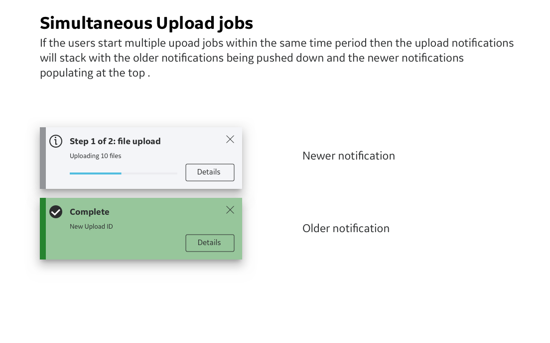
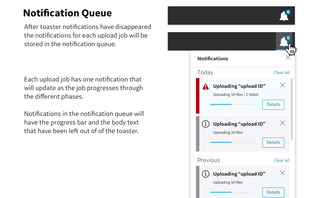
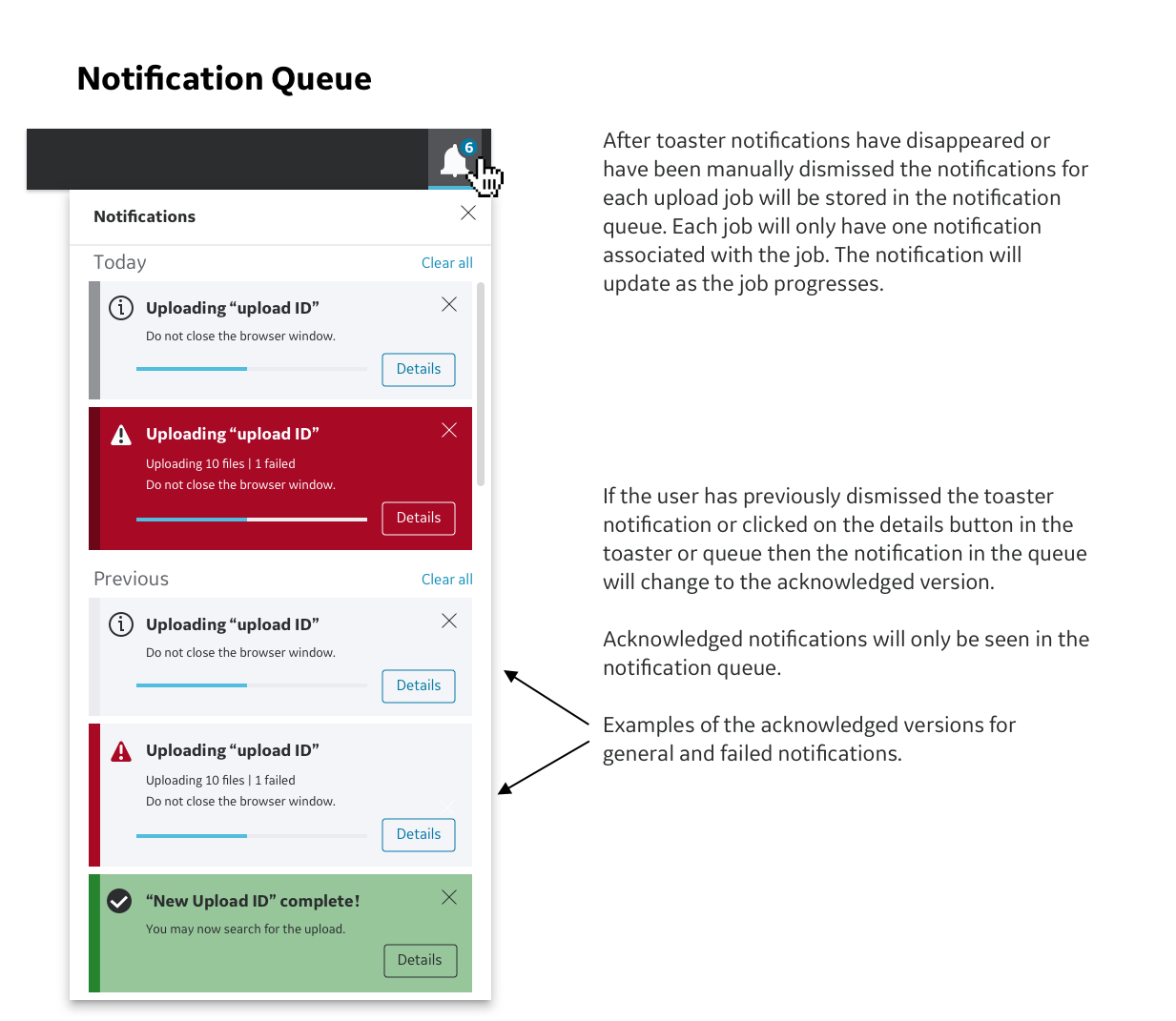
Since the upload job can take hours depending on the size of the files we also implemented UI that would store notifications for each job and can be used to store notifications for future features as this software platform continues to be developed.
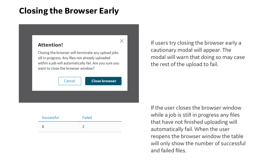
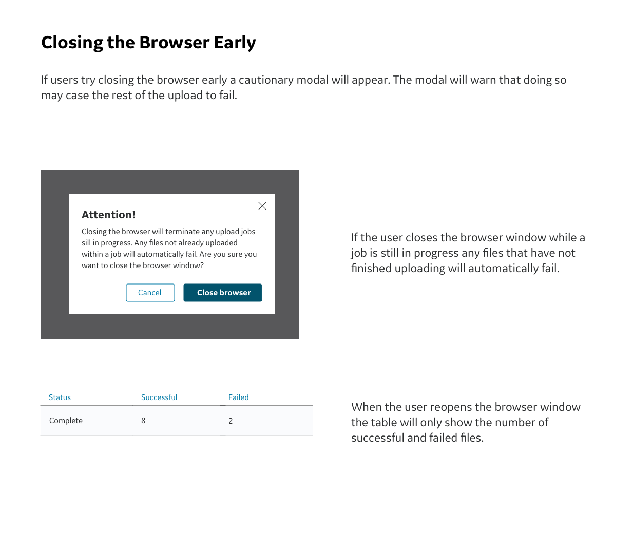
As an additional feature we implemented a warning system that informs the user when it is safe to close the browser window without disrupting the upload job.
The Context
The software platform for which this upload notification system was created allows users to develop AI algorithms to identify certain health conditions in medical imaging such as x-rays, MRI, CT scans, etc. Users can do this by using the platform to annotate medical images to create ground truth, create experiments to develop and refine AI algorithms, and organize experiments in a project workflow. Users can upload their own images and data to be annotated or used in experiments.
This platform was created using the Edison Design System. For this project it is only possible to show pieces of the UI rather than entire screens or screens that have been altered.
Our Team Consisted Of:
UX Researcher — Akshatha Pandith lead and conducted user interviews and user testing sessions.
Project Managers — Matt Wickesburg and Ragu Ramakrishnan
UX Designers — myself as the UX designer creating workflows and design specs, Sean O’Conner as UX team lead.
Development team — many myriads of engineers both in San Ramon and in India.
Edison Design System Team — a.k.a. EDS team. A collection of visual designers and UX designers responsible for creating and maintaining the visual design system used across the healthcare business. In this case study they will act as the governing body that ensures our designs are consistent with EDS guidelines.
Personas For This Platform
Annotators — Medical specialists such as radiologists who annotate medical images to create ground truth or check annotations made by the AI.
Data Scientists — Creates and runs experiments to develop and refine AI algorithms using data and ground truth.
Project Managers — Delegates tasks, organizes experiments as a project, manages other users.
The Design Process
Before the redesign this is how uploading files worked.
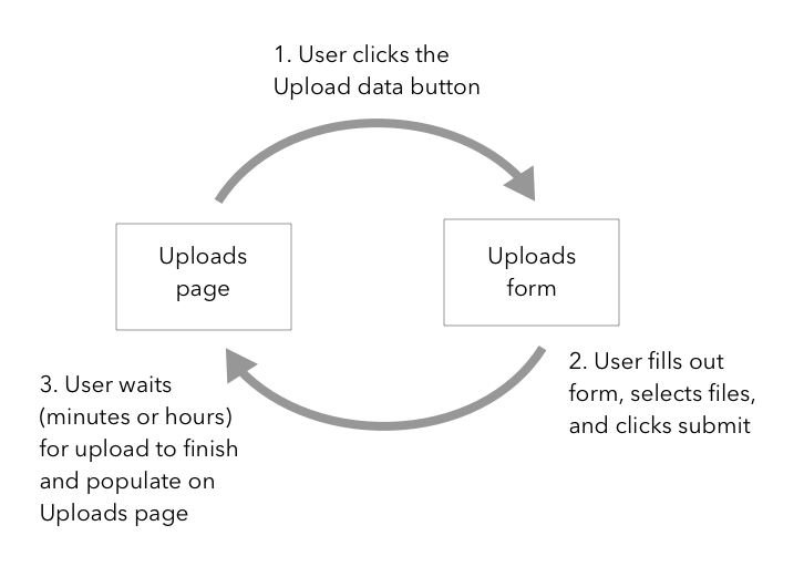
On the upload page the user will click on the Upload data button.
This will bring up the Upload form for the user to fill out.
Once the user fills out the upload form and clicks submit the user will be brought back to the upload page. There was no way for users to know when the upload job has finished and can be searched for to use for experiments.
Research and Requirements
In this particular case study UX research and requirements have already been collected by the UX researcher and project manager from internal users. The UX research findings cannot be disclosed in more detail since this platform is still in development.
As the UX designer I worked with this list of requirements:
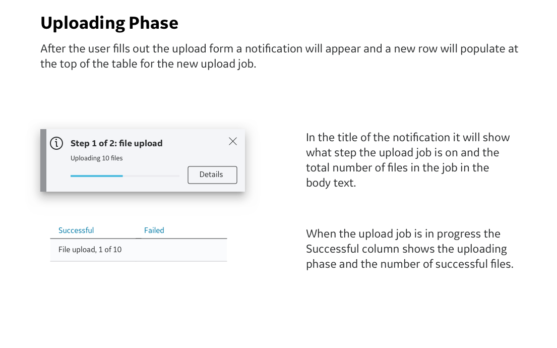
Create a notification that would show users that their upload job has begun.
The notification would include a progress bar that shows the current percentage of completion of the upload job.
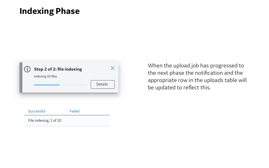
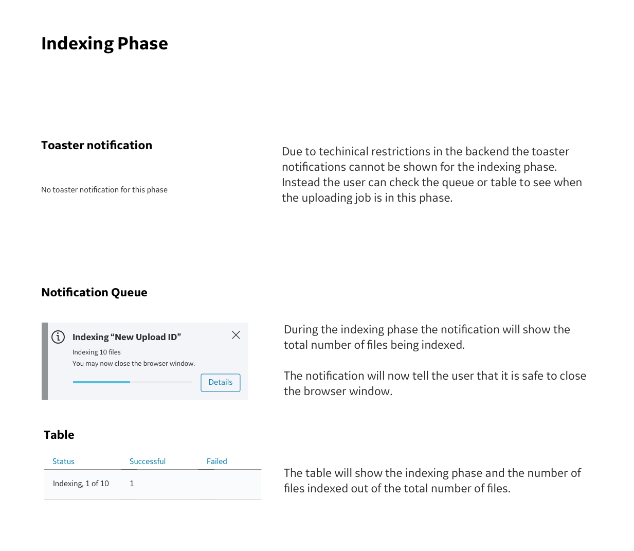
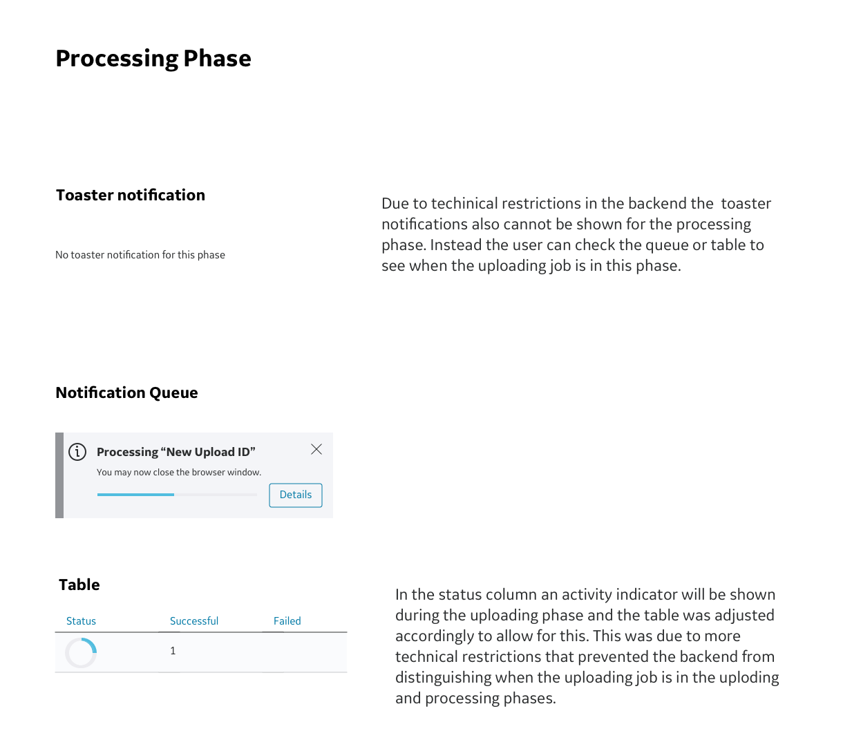
The notification would show the phase that the upload job is currently in.
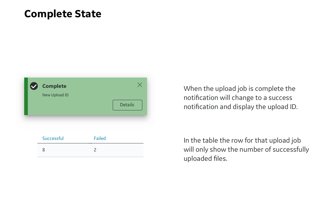
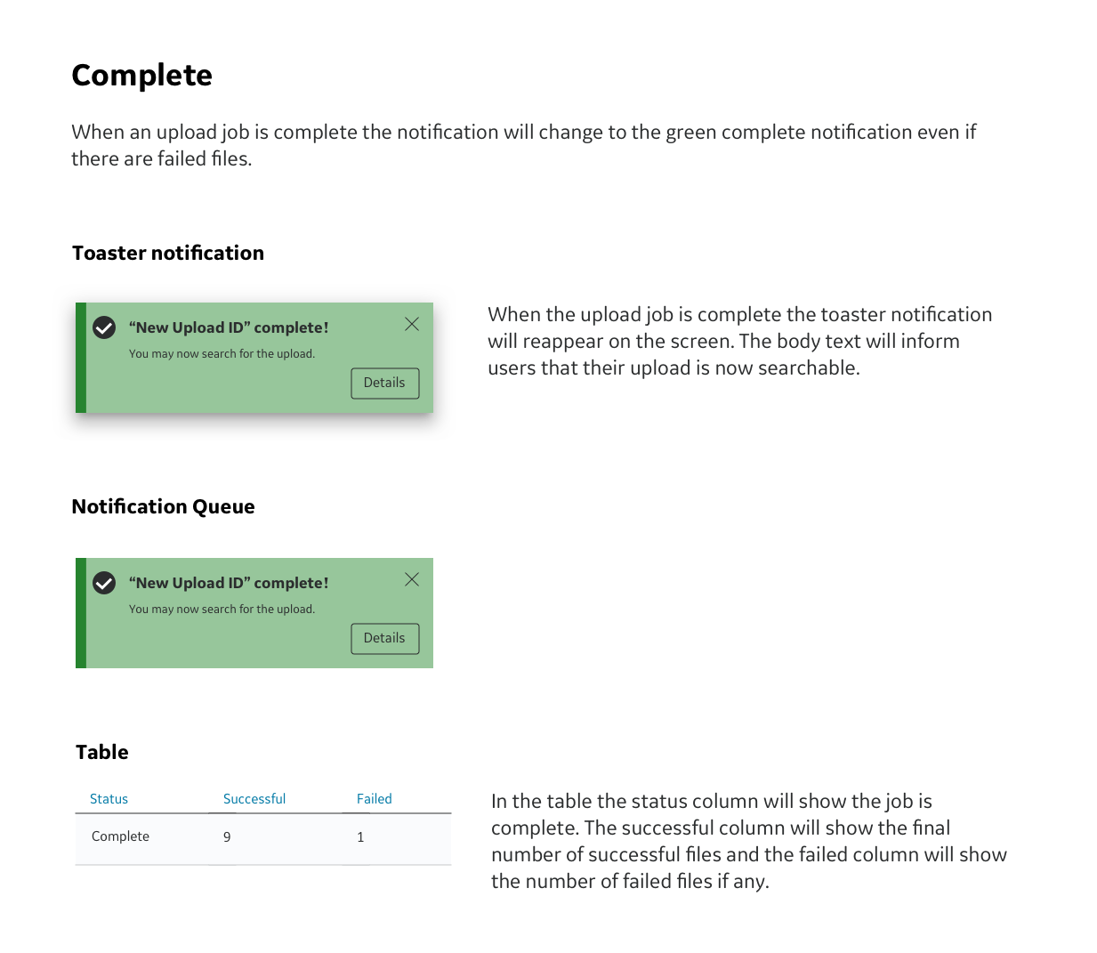
Create a second notification for successful completion.
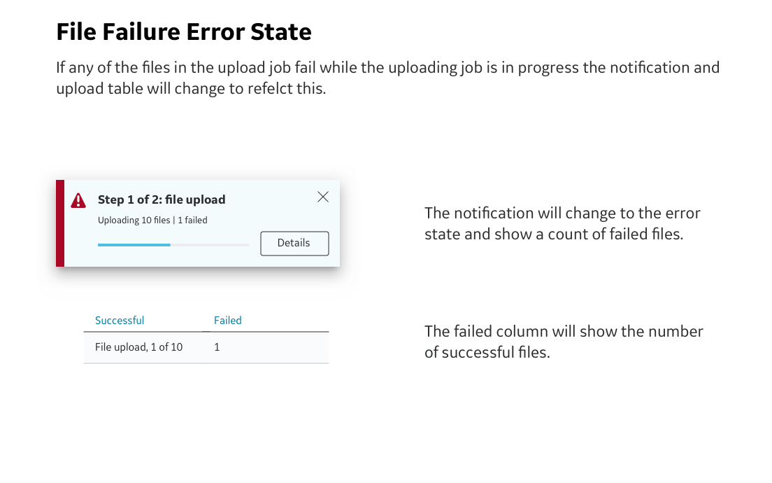
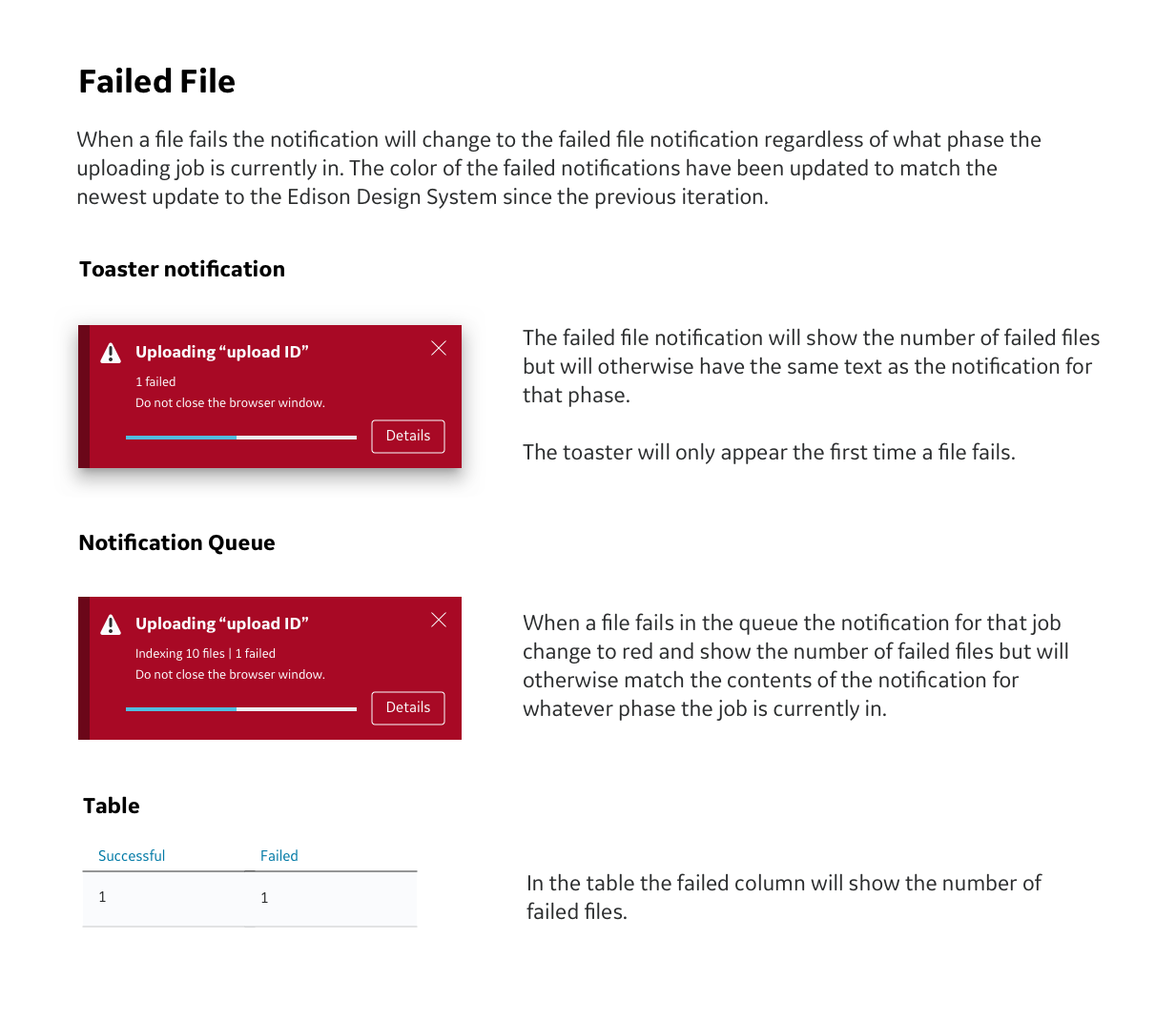
Create a third notification for when a file fails while uploading.
Applicable user personas: All. For this feature all personas would be able to upload files. It is more important that users have access to all of notifications for upload jobs they have initiated. As a result access to notifications will be based on individual user profiles rather than persona groups.
First Iteration
Since this platform is not yet public it will only be possible to show partial UI rather than full screens or work flows.
First Iteration Feedback
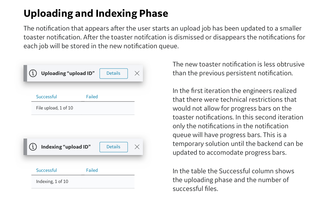
Some early feedback we received from users was that having notifications persist until dismissed could get annoying. Originally notifications were meant to persist until dismissed. While this might be impractical if the upload jobs took a long time to complete, it was a reasonable solution that was possible with the current state of this platform. I was able to use this feedback as an opportunity to suggest the need for a more involved notification structure to store and view notifications. I successfully argued that if we added a notification queue to the platform we could change the persistent notifications to toaster notifications. The toaster notifications could then be stored in the notification queue after they disappeared. This would also be a future investment in infrastructure for the platform and could be used for other types of notifications in the future.
Overall feedback on the design of the notification was positive and users liked the addition of the progress bar.
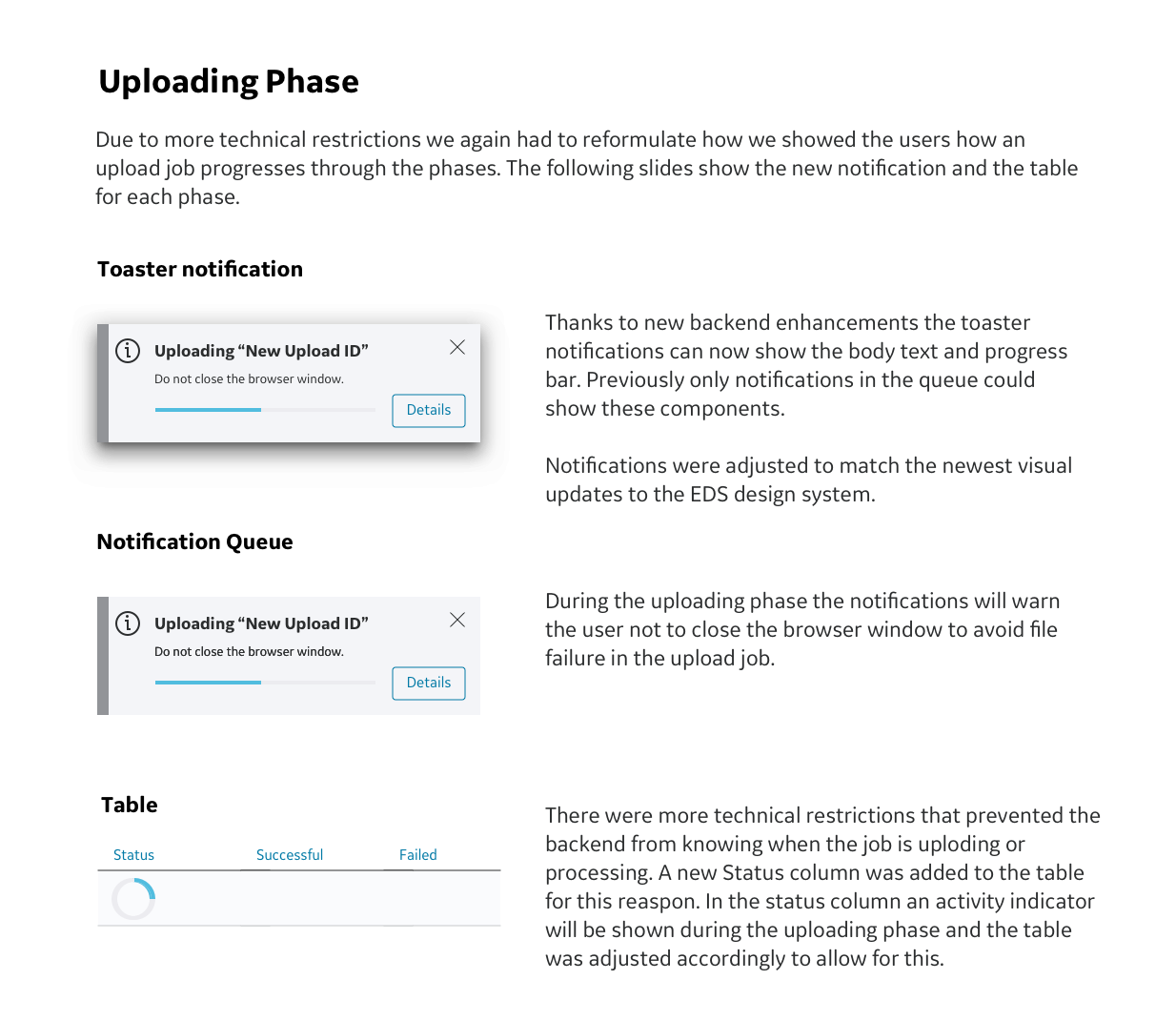
When the development team reviewed the first iteration they told us about a technical restriction that did not allow them to know the exact percentage of completion of the upload job. For the time being notifications will not have a progress bar until the backend is updated.
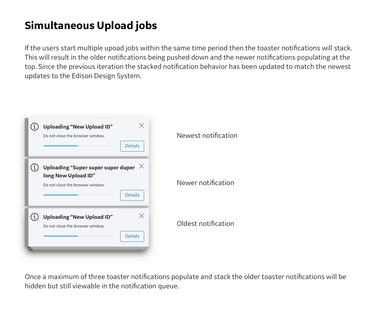
As part of the design cycle the EDS team ( who consists of the visual designers for the Edison Design System) reviews all new designs to verify that they conform to EDS standards. The EDS team gave us some feedback that the notifications would need to be moved to the upper right corner in order to comply with the newest EDS update.
Second Iteration
The second iteration of the design consists of updates to the first iteration. Since this platform is not yet public it will only be possible to show partial UI rather than full screens or work flows.
Second Iteration Feedback
At this stage requirements were beginning to shift as scope creep settled in. This was due in part to personnel changes and inconsistent information about technical restrictions.
Users loved the notification queue! It made them feel less anxious that they might accidentally miss a notification and that it would make it easier for them to check on the status of upload jobs.
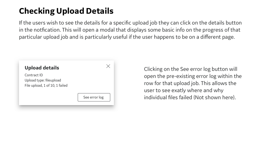
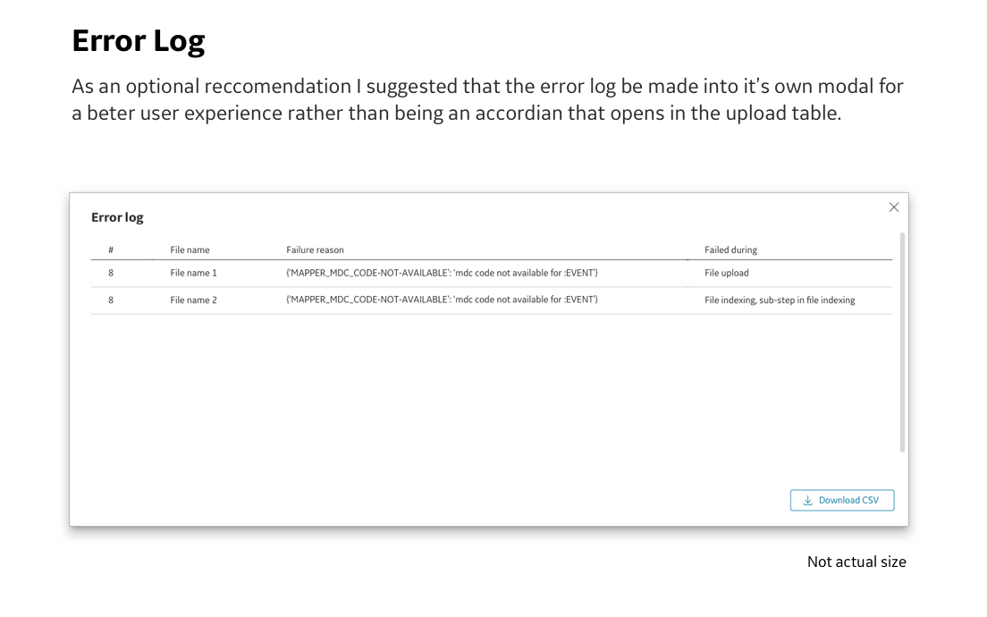
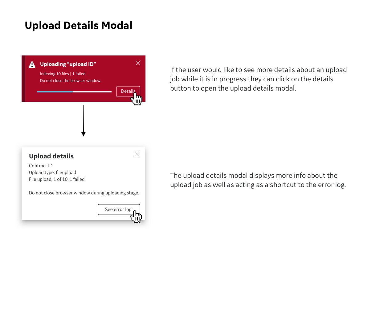
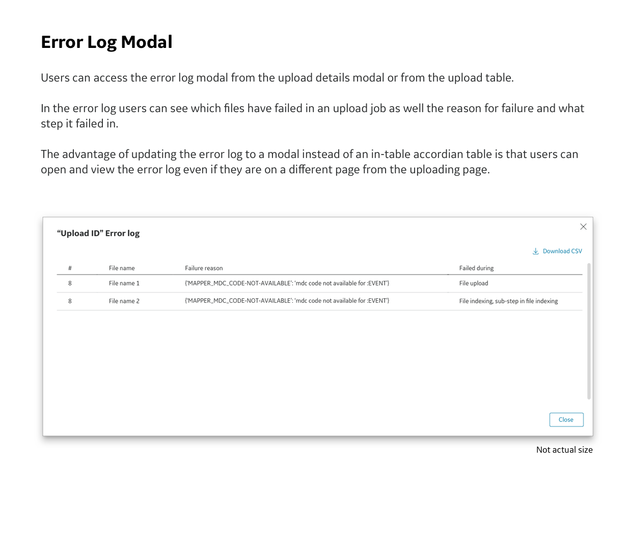
The engineers in the development team brought up more technical restrictions that opening the error log would be problematic if the user was not on the upload page. I used this opportunity to suggest that we implement the alternate design that I just recommended in the second iteration. In this new design the error log opens as a modal instead of the legacy accordion within the table.
Additionally the development team notified us that instead of just having two phases within an upload job (uploading and indexing) there was also a third phase, the processing phase, that we had to account for. We would have to reformulate the flows and how we showed the user what phase the upload job was currently in.
We received new feedback from the EDS team that there had been a new update to the EDS system and that we would need to update the size and some colors of the notifications.
It became apparent that the upload form (not shown in this case study) is badly in need of an update. As more fields and options have been added in every update the UX has suffered. It has become very confusing for users to navigate the options.
Third Iteration
The latest and fullest flow of notifications during an upload job to date. Since this platform is not yet public it will only be possible to show partial UI rather than full screens or work flows.
Next Steps
At the time that I was working on this project there was still talk of developing more versions. To continue improving the user experience these are the next steps that I would take.
Conduct more user testing on the newest iteration to see how users react to the toasters. In particular we should test to see if it is enough for them to be notified with a toaster for only the start, completion, and error states. Do they need to see toaster notifications for indexing and processing phase?
User test the upload details modal to see if the wording is effective or can be improved in light of the most recent updates to the wording in the notifications.
Update upload form - from user testing and feedback throughout the design process it has become apparent that the upload form also needs a holistic update. The original concept of a short form on a modal has had so many options added to it over time that the UX has been significantly impacted. The fields for this form have even spilled over onto a second modal. If I were to update this form the user would click on the upload button and would then be taken to a second page. This would replace the current modal and would provide enough space for all of the additional upload fields and options. Redesigning this feature is out of scope for this project but would be a good future project.
Continue to update the backend so that we have a smoother UX experience. This could include updates like allowing the table to show the uploading and processing steps in the status column instead of just the activity indicator.