The Design Problem
Users need an automated way to detect, measure, and track brain aneurysms over long periods of time. Specifically they want to see any growth for each brain aneurysm, the parent vessel, and location in the overall anatomy. This is because growth patterns are good predictors of rupture which can lead to the death of the patient. Earlier detection and tracking can save lives.
At the time of writing it was estimated that 15-30% of brain aneurysms are missed because it was very time consuming for users to find them. Usually patients get a head scan for something else (stroke, head trauma, etc) and the aneurysm is an incidental finding. Since radiologists have such high workloads and are not usually looking for these aneurysms they are often missed. When found they have to be manually measured which is time consuming and error prone.
Our Solution
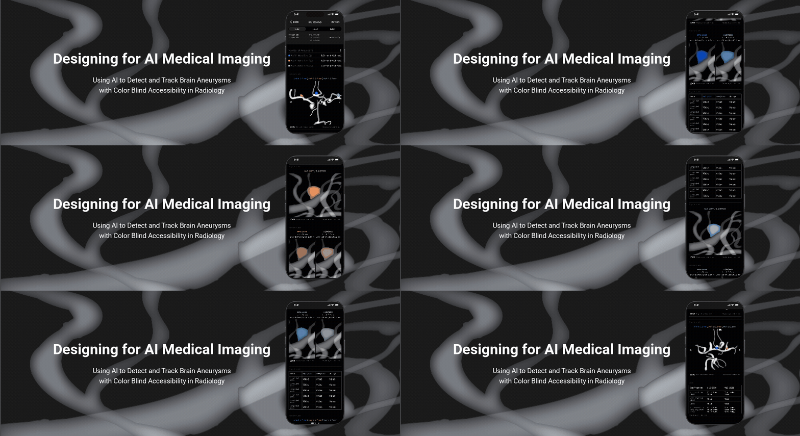
We created a new disease module for the pre-existing mobile app that led to a 23% increase in detection of aneurysms. It uses AI to detect, measure, and compare aneurysms over long periods of time with color blind accessible imaging that reduces human error.
The Aneurysm solution included:
Designing the AI generated, medical imaging outputs to match the preexisting style guide and give them a cohesive feel overall.
Creating a design template for data tables in image outputs.
Later goals grew to include accessibility for color blindness for medical imaging in dark mode. I created a new color blind accessible palette for dark mode medical imaging that meets AA Web Accessibility standards and also works for users with typical vision. While there are color blind palettes available on the web these were designed for user interfaces or infographs in light mode. Our users are used to looking at medical imaging in dark mode such as X-rays. This is especially true of radiologist users who work exclusively in dark mode in darkened rooms.
Establishing new standards to support color blindness in our app and the company in general.
Making sure user needs were met and existing workflow considered when ordering image outputs and data in the mobile app.
While the original designs were done in Figma, the images in this case study are low fidelity approximations for confidentiality reasons.
The Context
What is a Brain Aneurysm?
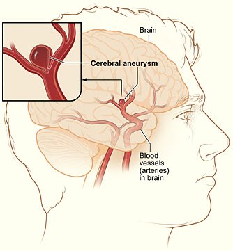
Brain aneurysms form when a blood vessel in the brain stretches and fills with blood like a water balloon. The growth rate and the way growth develops allows users, like neurointerventionists, to determine the risk of rupture. High risk patients need medication or a medical procedure such as clamping or coiling. If an aneurysm leaks or ruptures it can be life threatening, causing brain damage or a hemorrhagic stroke. Unruptured brain aneurysms have no symptoms, grow slowly, and are considered a non-acute condition that needs to be tracked over many years.
User Personas
Neurologists and Neurointerventionists - These users are the doctors directly treating the patient. Since they review medical imaging and data to make diagnoses, treatment decisions, and treatment plans in order to treat patients they are often overloaded with information. They can have a lot of power within their hospital system to influence decisions. They use our mobile app to preview imaging and will need to view both current and past imaging for specific patients. They tend to be ambitious high achievers and want to be at the cutting edge of their field. They can work in both light and dark environments but probably dark environments.
Radiologists - These users review medical imaging to identify and diagnose a variety of medical conditions. They write detailed reports about their findings for physicians. They tend to work in dark rooms with multiple screens and have a high workload. They often review hundreds of medical images per day. They want to have high accuracy while being as fast and efficient as possible since they tend to be paid by volume.
Our Team
Clinical project manager - Since we work in healthcare the PM has a clinical/medical background. They often acts as the resident medical expert as well as a stand-in for users at the early stage of development. A separate technical PM will execute the technical development of the project which will not be covered in this case study.
AI/ML engineer - The AI and machine learning engineers produce the algorithms and medical imaging outputs. They do not use typical programming languages for mobile and website development like CSS, Swift, or HTML. Instead they use other programming languages like Python or BTK. Since I design in Figma the specs that I produced did not exactly match the programming languages that the AI/ML engineers were using. The engineers and I had to work together closely from early on in the design process to make sure that designs were viable.
User researcher - The user researcher gathered feedback from users after we created initial designs for medical imaging outputs, and later, the mobile UI mock ups.
Designer - I acted as the lead designer on this project working on designing the medical imaging outputs, color palette, and mobile workflow. I also gathered feedback from the rest of the design team during this project.
Regulatory department - While these stake holders were not actively on the team their feedback was essential to developing the Aneurysm module and obtaining the FDA approval needed to be able to sell our products to hospitals.
The Design Process
Research and Requirements
When I started working on this project very little initial research specific to this project had been done. We mostly worked off of pre-built personas and the project manager’s initial ideas of user needs based on informal conversations with customers.
Initial Requirements:
Clean up initial AI medical imaging outputs created by the AI/ML engineers to match preexisting styling and give a more cohesive feel to the outputs overall.
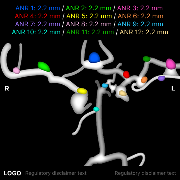
For the anterior (front view) overview image output showing overall anatomy and the position of all aneurysms, create a 12 color palette so users can differentiate up to 12 aneurysms per patient.
Create a design template for the tracking table to compare individual aneurysms over time.
Create a standard footer with logo and disclaimer text as required by FDA regulations. Define behavior for different types of disclaimer text depending on where the medical imaging outputs are being displayed.
Incorporate output images and required data into our existing mobile app in a way that considers user needs and workflow for viewing previous and current imaging when treating brain aneurysms.
Design the mobile app flow as a preview tool rather than a full diagnostic tool. This mobile app module would complement a desktop app where users can fully manipulate the 3D model generated by AI using CT scans as well as create treatment plans. A business decision was made that the mobile and desktop app would be designed separately.
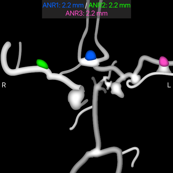
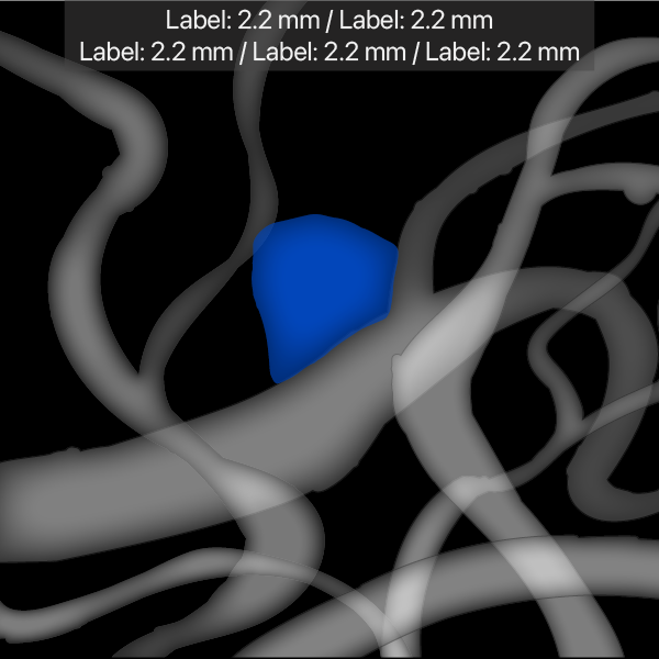
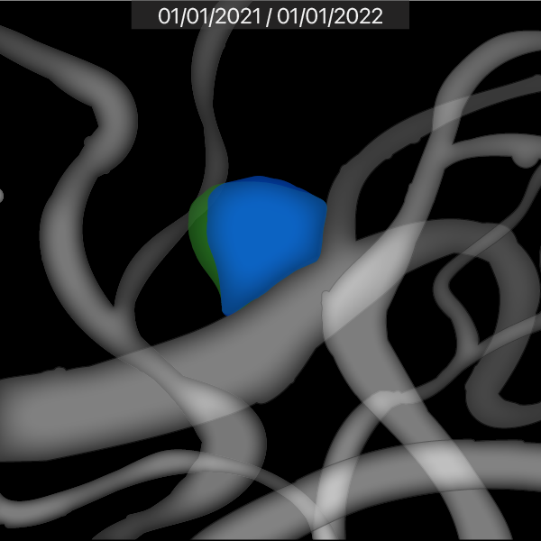
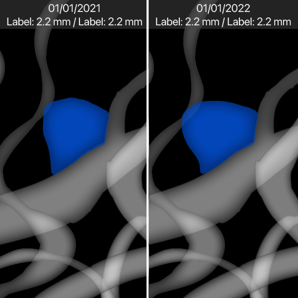
Above are recreations of rough image outputs I initially received from the clinical project manager. For confidentiality reasons none of the original images from this project can be displayed, all designs in this case study are low fidelity approximations. The initial rough image outputs were created by the AI/ML team and the clinical PM without input from design. The first colors used were a group of imaging colors already in the design system. However, it turned out that these colors came from a time that predates any designers in the company. There does not seem to be any design logic behind it. As a result some of these original imaging colors do not have enough contrast against black to meet the AA Web Accessibility standards we already use as a company standard.
The First Iteration - All About the AI Image Outputs
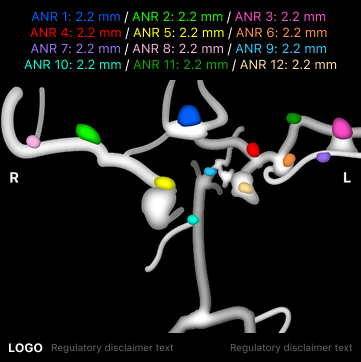
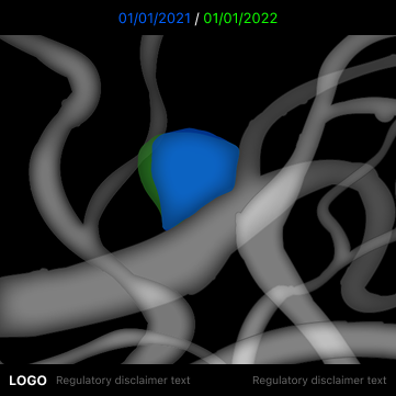
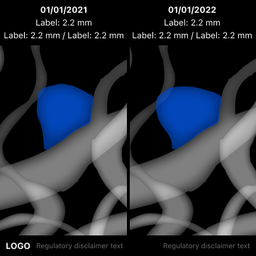
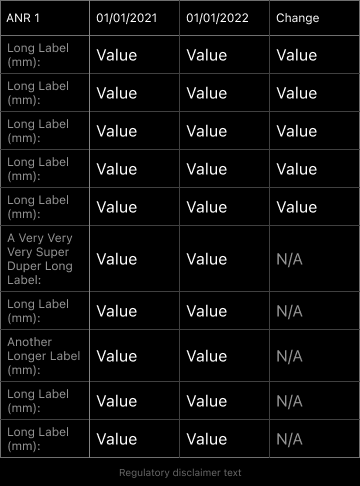
In the first iteration of designs I focused on redesigning the initial output images to match preexisting designs in our app and give a more cohesive feel to these aneurysm outputs overall. Font, text size, and typography were all standardized and a solid black background was placed between all text and the image to ensure legibility.
In the anterior overview image, which shows an overall view of the arteries in the brain from the front, I selected 12 distinct colors that would allow users to see which max size was associated with each aneurysm. At this point the requirement was to support up to 12 aneurysms per patient. The original blue and green colors from the initial images persisted in this first iteration since we had not yet realized they did not meet contrast requirements.
The style of the aneurysm tracking table designs were based on previous tables I designed for email templates. A design decision was made to generate the tables as static image outputs rather than code it into the app. Since the metadata for scans can be long and every mobile phone has different dimensions the table as an image output was the best way to guarantee that the table would display well and be legible. An added bonus of making the table a static image meant that users could zoom in to read text if needed.
At the bottom of the image outputs I added a footer with the logo and disclaimer text required by FDA regulations. Depending on where the outputs are being displayed in mobile or PACS or where the product is in the FDA clearance process different disclaimer text will be shown. The company logo will always be shown.
First Iteration Feedback - Color Us Surprised
The feedback from the clinical PM and the AI/ML engineer on early designs was very positive. However the engineer quickly raised the issue of color blindness. In the anterior overview image they could not differentiate all the colors in the worst case scenario of 12 aneurysm. So with their help and feedback we developed another color palette for the anterior overviews that was accessible, at least to them. While the color blind population is a minority in the medical community we made a decision to support them in our medical imaging for several reasons. If a user cannot interpret the imaging due to color blindness then they are more likely to make costly errors that invalidates the whole point of this specialized imaging. Some information was found later that indicated radiologists may be more likely to be color blind than other types of doctors. Additionally, after asking some of our more customer-facing coworkers we found that there had already been several requests to support color blindness. However due to technical restraints we could not implement a separate color blind mode. Our hope was that by developing support for both color blindness and typical vision in this project we could reuse it in future projects.
A clinical decision was made to cap the number of shown aneurysms at 9 instead of 12. The reasoning by our internal clinical experts was that by 9 aneurysms the patient would be very ill and be likely have multiple serious health issues. At this point the user would prefer to go into the desktop app to plan immediate treatment where they could view the full 3D model and any additional aneurysms. The 3D model can be freely rotated and manipulated in ways that cannot be supported in the mobile app.
The tracking table was well received but the PM said it would be better to split off the long scan metadata from the rest of the aneurysm data. Additional feed back from the engineers was that the table was over designed in terms of line colors and that it would be very difficult to accommodate this relatively minor aspect of the design. Considering the value that these design elements provide we decided to remove that variation in color in the next iteration.
Design Team Feedback - Seeing Through Color Blind Glasses
Feedback from the rest of the design team included the director of design, the other product designer, and the user researcher who had not yet joined this project. The other product designer told me about a great plugin for Figma called Stark. It allows designers to simulate different kinds of vision conditions including the 4 different types of color blindness. This completely changed the way I was able to design the color blind palette! I could finally see a good approximation of what the colors looked like to a color blind person and no longer had to rely on getting time from the color blind engineer. The engineer also had never been evaluated and did not know what type of color blindness they had.
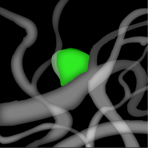
As I got to the point where the image outputs could be arranged in a mobile screen mock up, our design director made a great observation that we could add a lot of value by giving each aneurysm a specific color identity using the same palette from the anterior overview image. Close ups of individual aneurysms could then be easily matched with their place in the anterior overview images.
The Second Iteration - Researching Color Blindness and Writing My Own Requirements
Up to this point we assumed that it would be enough if we just had a color blind person sign off on the colors. We did not have a way to account for the different types of color blindness short of putting together a panel of users pre-evaluated for color blindness. Now empowered with this new vision simulator it quickly became apparent that there was no solution that could support all types of color blindness for a 9 color palette in dark mode medical imaging that also met AA Web Accessibility standards. I was going to have to define my own boundaries and requirements for the design of this palette. Doing some of my own research on color blindness these were the main points and decisions that came from that research:
The different types of color blindness are Deuteranopia (green color blindness), Protanopia (red color blindness), Tritanopia (blue-yellow color blindness), and Achromotopsia/Monochromacy (complete color blindness, grayscale only).
There is a range of severity for different color blindness types. For example Deuteranopia is complete green color blindness but Deuteranomaly means that a person can partially see green to various degrees.
Color blind people make up 8-10% of the population, mostly men. I decided this palette would only support Deuteranopia/Deuteranomaly (5-6%) and Protanopia/Protanomaly (~2%). These are the most common types of color blindness and happen to be similar enough that we can accommodate both.
The palette will not support Tritanopia/Tritanomaly or Achromatopsia/Achromatomaly which together make up less than 1-2% of the population or 1 in 33k to 50k people. Achromatopsia is considered a moderate disability and people with this condition are ineligible for a commercial driver’s license. They may not even be able to get a regular driver’s license. We decided to make the assumption that someone with achromatopsia would not be able to become a surgeon as they would have trouble distinguishing between different types of tissue.
Additional questions I was not able to answer in the time allotted for my research:
Is there a vision test to become a licensed doctor? If so what is the criteria?
Are there actually color blind doctors and radiologists that we need to accommodate? What is their prevalence?
Prepping for User Feedback - The User Researcher Enters the Fray
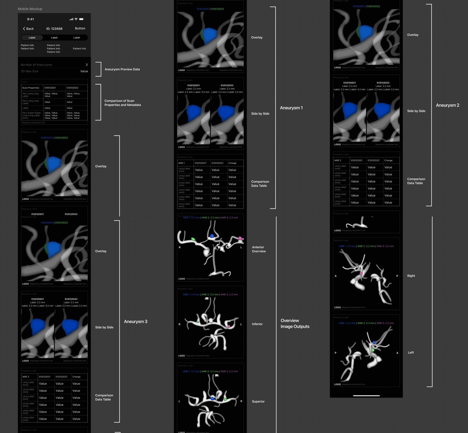
The user researcher joined this project while I was doing research into color blindness and color palettes. Since we did not yet have enough design work to do user testing they decided to use mock ups to gather user feedback on pain points, needs, and workflow, as well as asking some of my unanswered questions about vision requirements in the medical industry.
For the first pass of the mobile mock ups we made some assumptions on the ordering of information and images based on the clinical PM’s knowledge of users needs, workflow, and what users would find most important or helpful.
Aneurysm preview data at the top of the screen for the number of aneurysms found and the max size for each aneurysm for the current series.
Comparison of scan properties and metadata for the previous and current scan series.
The overlay image output of the first aneurysm for the previous and current scans.
The side by side comparison image output of the first aneurysm for the previous and current scans.
The tracking/comparison data table image output of the first aneurysm for the previous and current scans.
The overlay, side by side comparison, and tracking/comparison data table image outputs would repeat as a group (items 3-5 from the above list) for each additional aneurysm found in this series of images. In this case 3 aneurysms.
Anterior overview image output for all aneurysms.
Inferior, superior, posterior, right, and left overview image outputs for all aneurysms would follow to show every angle of the overall anatomy.
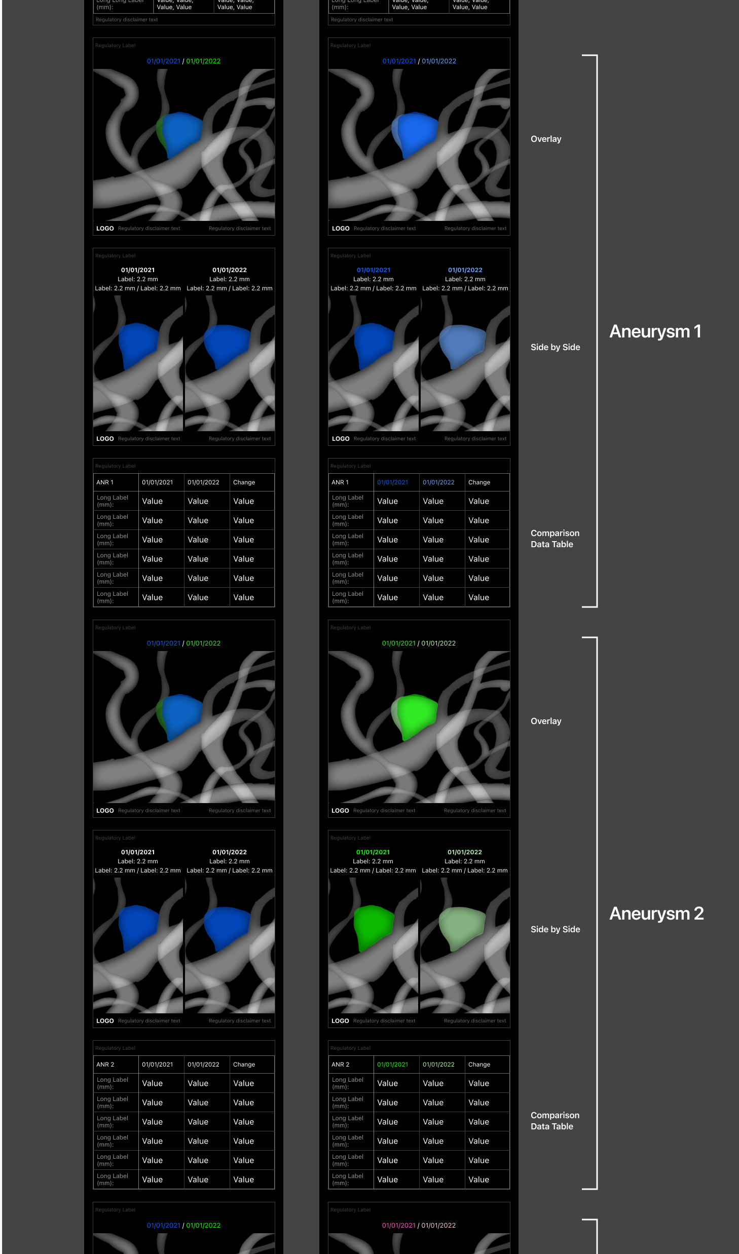
I also made a version of the mobile screens with image outputs for each individual aneurysm with a specific color identity from the Anterior Overview image as suggested by the director of design.
Second Iteration Feedback - User Feedback at Last
In our first round of structured feedback with real potential users the user researcher did a great job of getting feedback on image outputs, the ordering of images and data, as well as asking about color blindness in the medical profession.
In the U.S. there is no regulation about visual requirements in the medical profession. While users knew of other color blind medical professionals with red/green colorblindness it is not something that is talked about very openly. It sounds like historically radiologists could manage being color blind because the medical imaging has been in grayscale. However, with our annotated medical imaging we need to use a lot of colors so it is a good idea to start thinking about color blindness in all image outputs we design going forward.
In user feedback the version of mobile screens with unique color identities for individual aneurysms was overwhelmingly preferred by all users and was very helpful in breaking down the large amount of information.
It was not clear to users that wording about 3D Max Size in the aneurysm preview data was about the change in growth. In the next iteration we changed the wording to include max size and the change in growth. This was a much more helpful combination of information to users and gave them a better sense of rupture risk.
Third Iteration - Threading the Needle for the Color Blind Palette
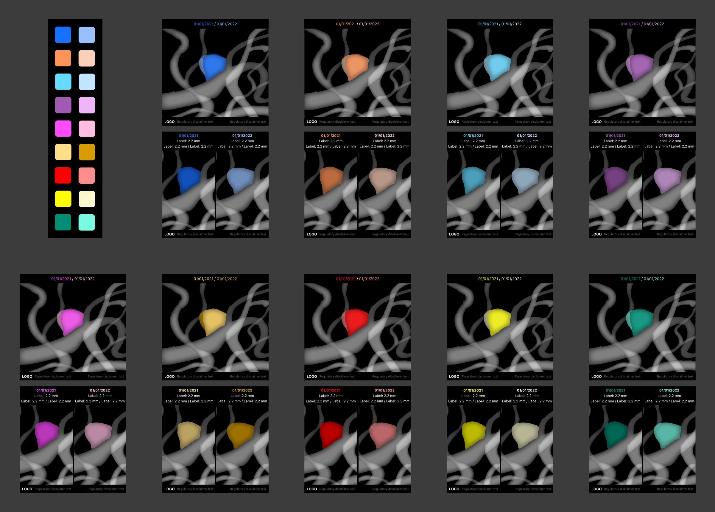
Using Stark’s Vision Simulator I was able to create the following color blind accessible palette that can support up to 9 aneurysms in dark mode medical imaging. This should give the color palette a high level of robustness as 9 aneurysms is a 1 in 10 year occurrence.
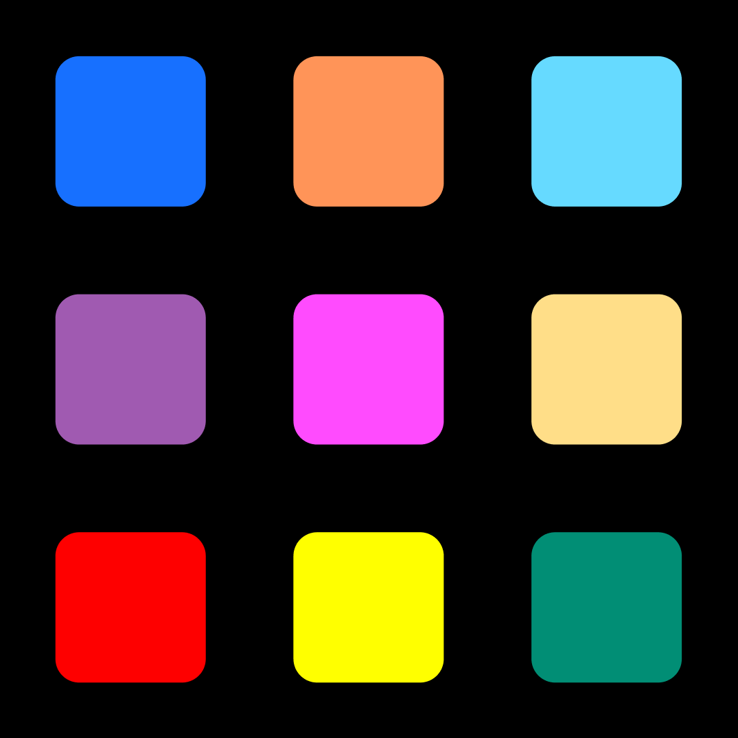
The is the what the palette looks like to someone with typical vision.
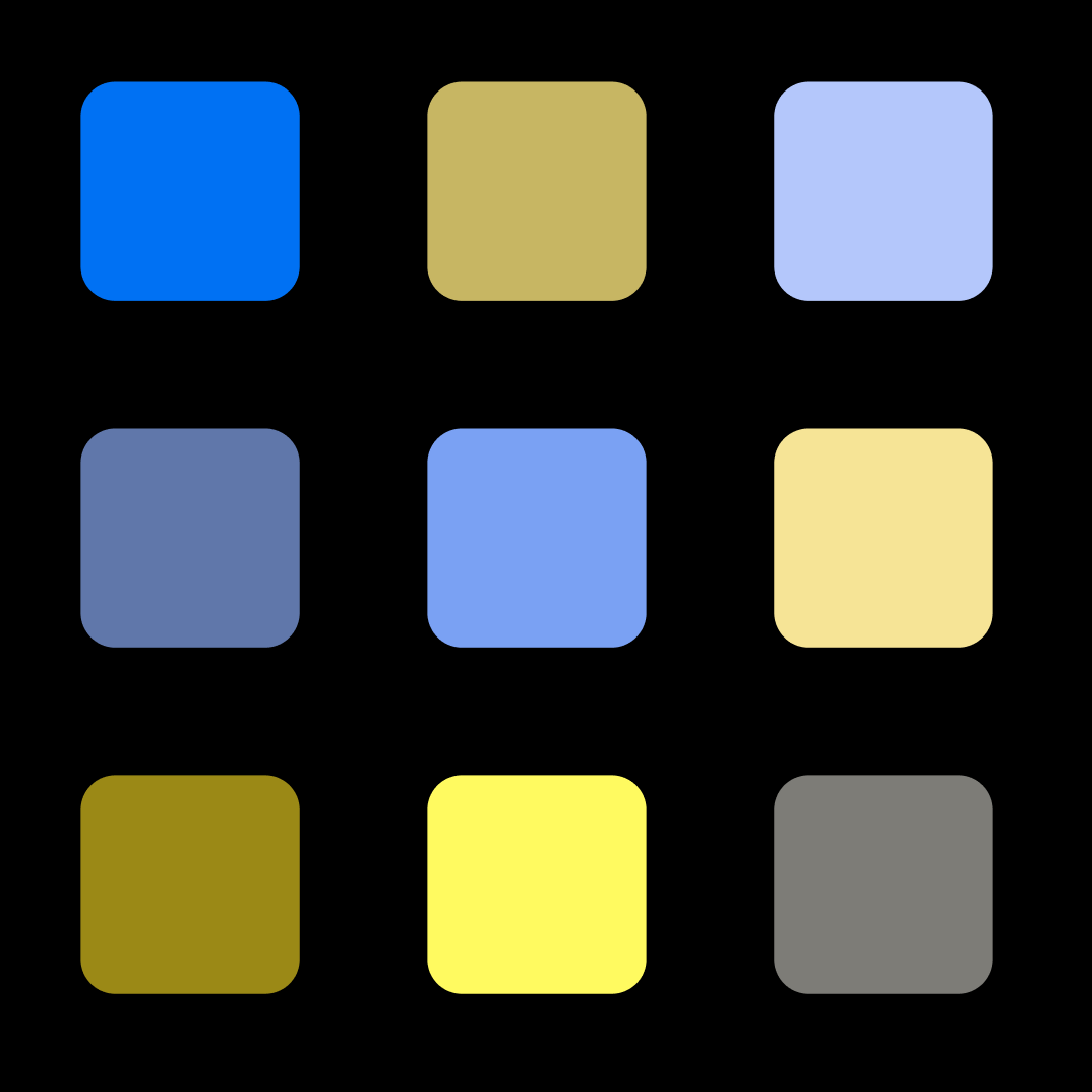
Using Stark’s vision simulator this is what that same color palette would look like to someone with Deuteranopia.
Strengths
This palette was designed so that a person with typical vision would be able to easily discern the colors from each other at a glance. For color blind people I did not have a big enough range of colors to work from to make them as easily discernible. Instead I settled for a palette where a color blind person could distinguish colors by process of elimination.
The colors conform to WCAG AA contrast ratio standards as text against black backgrounds both for people with typical vision and people with one of the supported color blindness types.
While WCAG is for text against backgrounds I did my best make sure that the colors would also stand out enough as colored objects against the grayscale background of the vessel anatomy. This means that the colors for the color blind palette are mostly saturated midtone colors since the grayscale of the vessels is in the light to mid-range of gray.
The order that these colors appear in was also carefully considered. In the anterior overview image output the colors will always appear in a certain order to maximize contrast and lessen the chances of putting certain colors next to each other. This has more potential to affect color blind users. Going from top left to bottom right the first 4 colors have the highest amount of discernability as a group. Most patients will only have 2-3 aneurysms. After that the next two colors are shades that have similar counterparts in the first 4 colors to a color blind user. The feedback from users was that after seeing that a user had about 4-5 aneurysm they would abandon the mobile preview and go to the desktop app to view the scans as those cases are rarer and more severe, therefore needing immediate attention. As a result the last three colors were more problematic colors and so were saved for last as it would be rare to see a patient with that many aneurysms. A patient with 9 aneurysm is a 1 in 10 year case. The most aneurysms our users have seen was 14 in a case which was in a patient near death with multiple comorbities. In the last 3 colors, the red and yellow were more alerty colors so we wanted to avoid using them early on for regulatory reasons. The green color was put last to mitigate it’s weaknesses which will be explained in the section below.
Limitations
At the time of this project the Stark plugin had it’s own limitations. It’s simulations are averages and of course we we will never truly know exactly how other people see color.
Color blind people can have multiple types of partial color blindness. This palette does not take that complexity into account. The hope is that by covering the 2 most common types of complete color blindness, those with multiple types of partial color blindness will also be covered.
The color blind palette is strongest with Deuteranopia (green color blindness, the most common type). Protanopia (red color blindness, the second most common type) is still supported but the colors are not as distinct as for Deuteranopia.
The last green color shows up as a midtone grey for the supported color blindness types. However at certain angles this grey color can blend into the anatomy if it appears in a shaded area and is easier to miss for small aneurysms. Since the requirements of this project was to support up to 9 aneurysm I had to go into colors that might blend into the grayscale anatomy for color blind users. I made it as dark as I could to avoid the light and midtone gray values used for the anatomical model while still having a AA Web Accessibility rating against black backgrounds.
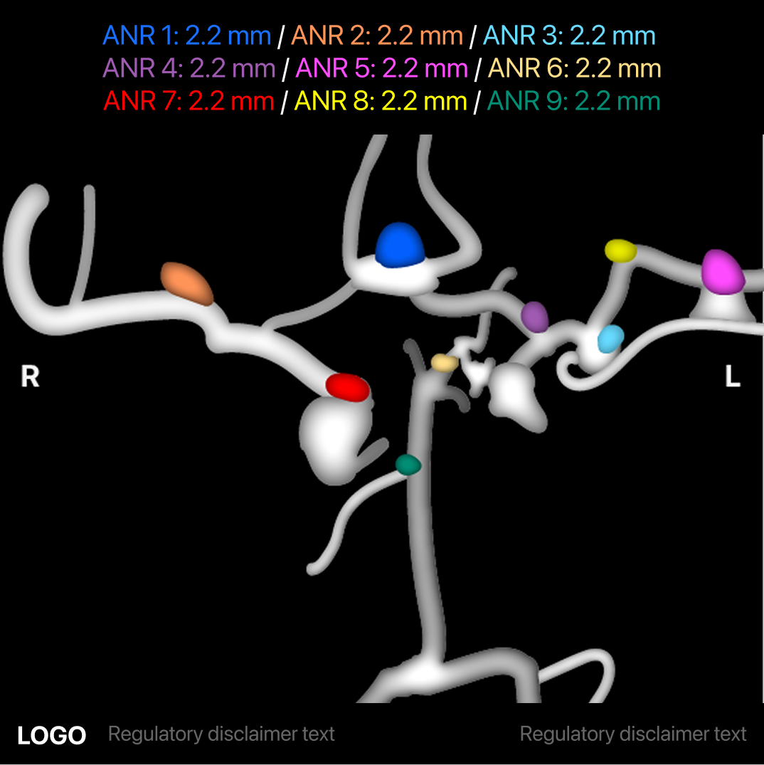
Anterior overview image with typical vision.
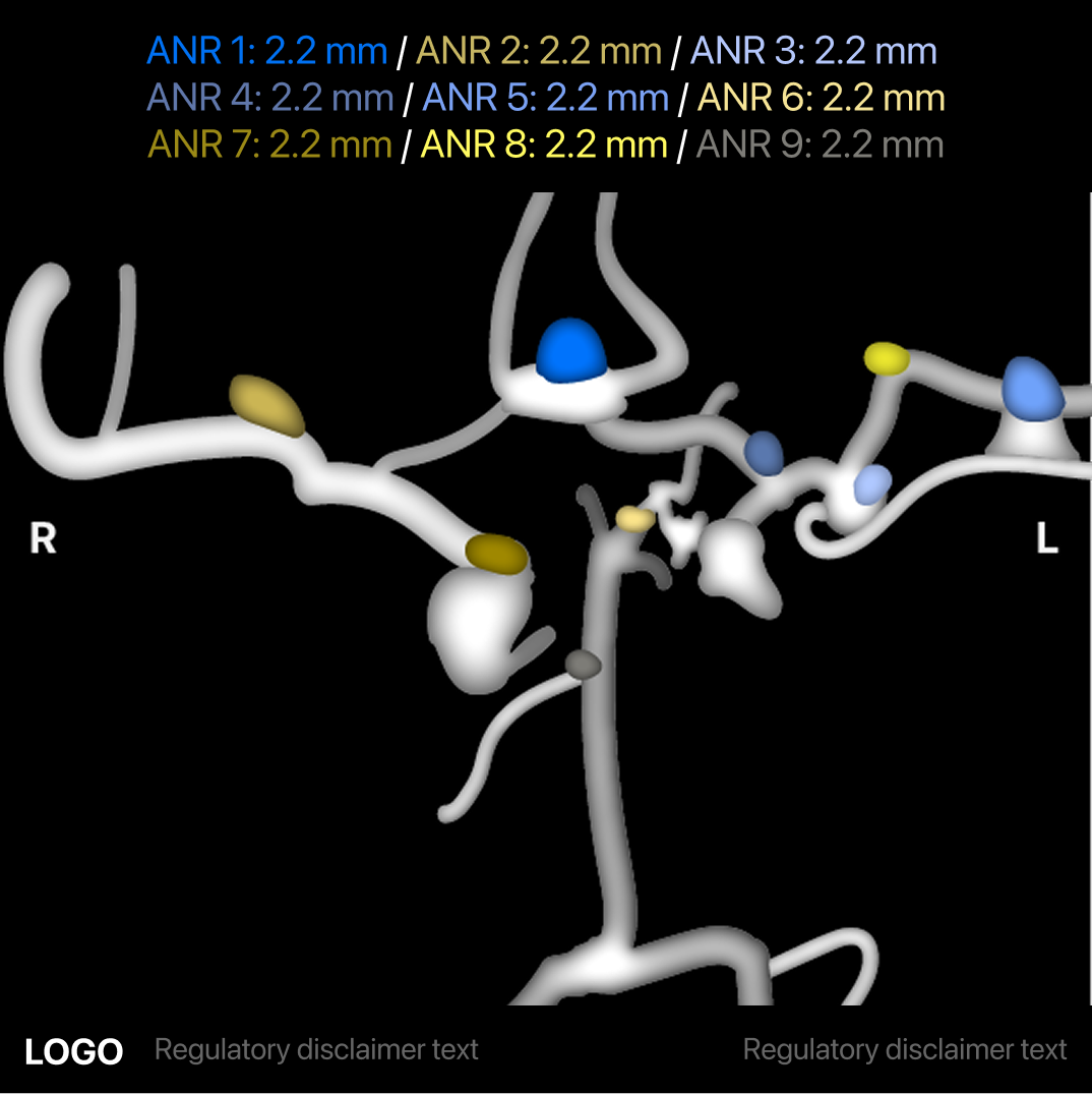
Anterior overview image with deuteranopia.
Third Iteration Feedback - Pulling it All Together
Even though this project did not have the time or the budget to put together a panel of color blind users I tested it internally on 5 coworkers with both typical and color blind vision. Unsurprisingly those with typical vision were able to easily match the text colors with the aneurysm colors correctly in the anterior overview image and, with a little more time, in the color blind simulated version of the overview image as well. I asked them to also match the simulated version in the hopes that it would act as a useful way to test the effectiveness of the simulator. Furthermore all colorblind coworkers were also able to correctly match the text with aneurysms when viewing both the overview image and the color blind simulated versions of the overview image. While this task took them longer than their colleagues with typical vision they were still able to successfully match all colors by process of elimination! This gave us the confidence that the color blind palette would have enough contrast for color blind users.
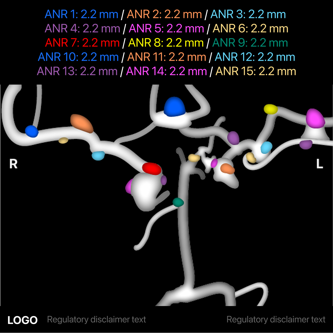
The regulatory department came back and said that we could not cap the number of aneurysms shown on the anterior overview image output and that all aneurysms in a patient has must be shown. Since 9 or more aneurysms are so rare we decided that the colors would simply repeat even if the labels started to cover the top part of the image. Such a case would be an emergency and users would immediately abandon this mobile previewing app to view the patient case in the more powerful desktop app where they can create an immediate treatment plan.
In the previous round of user feedback, users overwhelmingly preferred the version with each individual aneurysm having it’s own assigned color identity matching the Anterior Overview image. However, this also meant that the image outputs with overlays and the side by sides needed additional companion colors for the current scan of the aneurysm in order to match the individual color identities.
Companion colors were developed for each of the color blind accessible colors. While companion colors are not part of the color blind accessible palette as a group they were designed to have enough contrast between the color blind accessible color and vessels to stand out and are AA accessible for color blind and normal vision. Companion colors will only ever be shown with their associated color blind accessible color.
Final Ordering of Images and Data
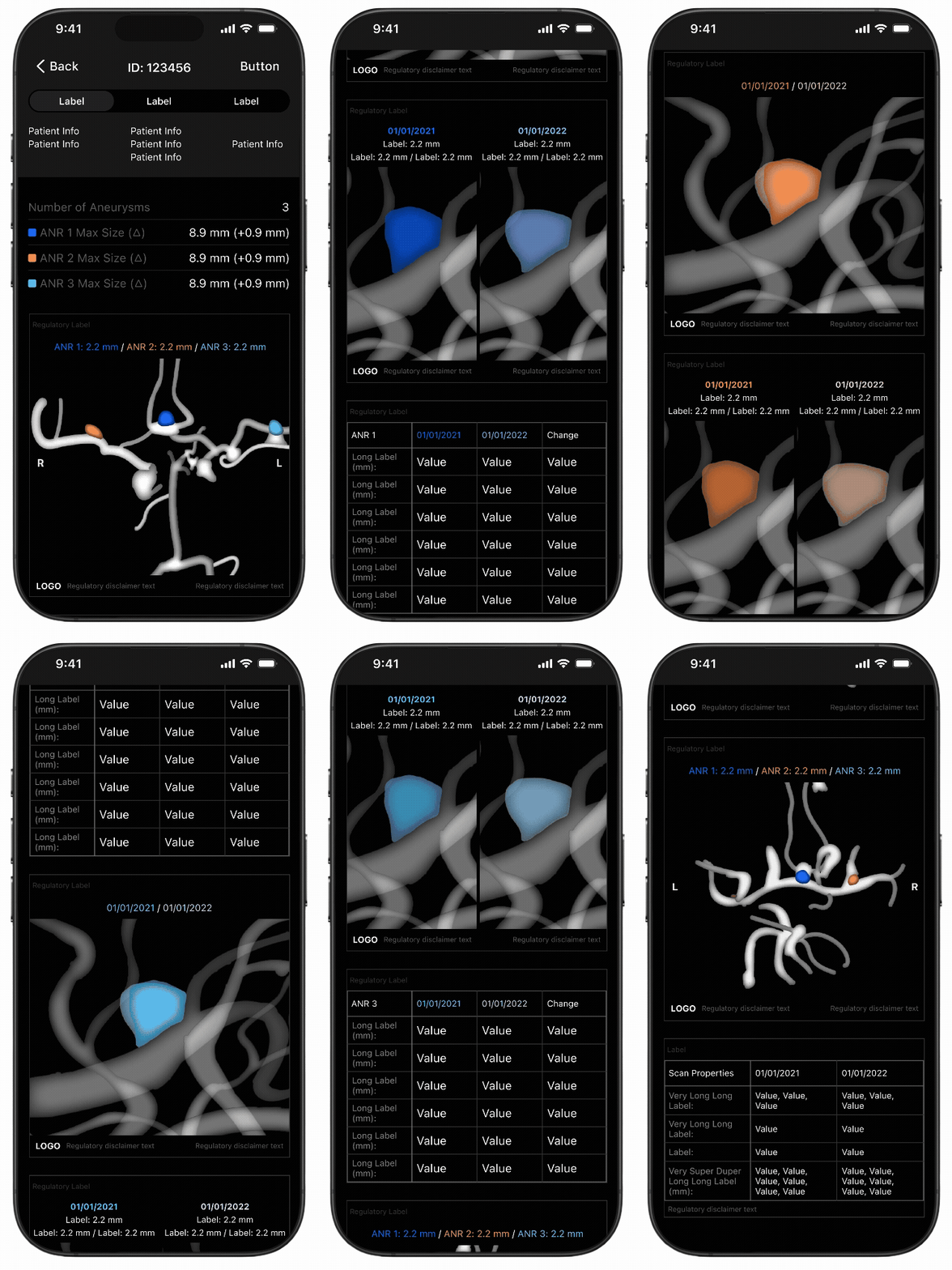
When the users were asked to rank the images in terms of what was most important to least several of the scans from different angles were eliminated altogether. The final ordering was:
Summary of key data for each aneurysm
Anterior overview image
Overlay, Side by side, Tracking table in that order for each aneurysm found
Inferior overview image
Superior overview image
Scan properties metadata table
Outcomes
23% increase in the detection of aneurysms leading to better patient outcomes.
Established standards for color blindness accessibility at the company. The standards defined in this project have already been used in other projects.
Developed color blind palette for dark mode medical imaging. This specialized palette has already been used in the development of medical images for other anatomical regions.
Established standardized behavior and imaging templates in the mobile app for long term tracking and image comparison. These standards and image templates have already been used in other projects comparing results over time.
Seamlessly integrates into the current neurointerventionists and radiologist workflow.
Next Steps
In the next iteration of this project I would propose the following features and metrics:
User test the color blind palette with a panel of color blind users in the medical profession.
In version 2 add back in the aneurysm metrics that got left behind due to time constraints. After designs were complete the regulatory department came back and said that other additional requirements needed to be added in order to get FDA approval. To meet timelines some metrics were left out of version 1 to reduce the engineering load.
Track metrics on long term patient tracking outcomes and ruptures. While a 23% increase in detection is a great start it does not show how the long term tracking workflow of aneurysms will affect patient mortality over time.
Iterate and develop version 2 of the Brain Aneurysm product with 3D and free rotation capabilities in the mobile app!